What's Different?
how DarkAudacity is different to Audacity®
The Differences - Quick Version
Feedback from Audacity users is that they have no difficulties finding their way around in DarkAudacity.- The menus have been rearranged, but the functions you need are still there.
- The Sync-Lock button has gone. Use Time-Lock from the Tracks menu instead.
- Recording adds to the end of your track, unless you hold shift down when you click 'Record', in which case it adds below.
- You won't get 'stuck in pause' now. Many items that were previously forbidden in pause are now allowed, and end pause when you click them.
- Some toolbars are hidden by default. If you want them you need to use View->Toolbars to enable them.
And now... Version 2.3.2x of DarkAudacity has arrived.
Many of the changes of 2.1.3x DarkAudacity are now optional settings in Audacity. You may have to dig for them, but they are now in Audacity itself. Meanwhile DarkAudacity has moved on. The intention is to continue to put pressure on Audacity to become sleeker and easier to use.
- Three Audacity toolbars, each with a 'microphone' and 'speaker' icon, have been combined into one toolbar. This removes clutter. It saves space. This recombination in DarkAudacity also solves the problem of 'which toolbar do I need?'.
- I have provided a new LED style for the meter. The LEDs make it easier to see when distortion of your audio is starting.
- I have added a new larger time display. It makes it easier to see the recording or playing time from a distance, e.g. when playing an instrument, with your laptop screen some distance away.
The Differences 2.3.2x - Long Version
Three toolbars have been combined.Previously we had a 'Mixer Toolbar' with a microphone and a speaker icon which set the volume levels. Now the volume level sliders are on the meters. This idea comes from the LMMS software where the volume sliders are on the meters. Thanks LMMS!
The volumes are controlled by dragging the orange circles.
Previously we had a 'Device Toolbar' too with a microphone and a speaker icon on it. So that was three each of the 'speaker icons' and the 'microphone icons'. The 'Device Toolbar' set which interface was used for recording and playing. Now those icons (at left) have become one button for speaker, one button for microphone, and you click on the buttons to change settings.
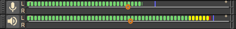
Three Toolbars - now combined into one
Click on the 'speaker' or 'microphone' button to change settings, including choosing the interface:
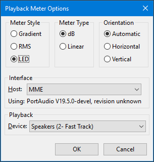
Options - from the 'speaker' button
The 'LED' option in the above dialog is new. The LED option uses a sharp colour change on the meter from green to yellow to indicate when you are in the danger zone for recording, and a sharp transition from yellow to red when you will actually be distorting/clipping sound.
The meter can be dragged from its position, so that it becomes a 'floating window', and then the bottom right corner dragged out to make it bigger, as you can see below:
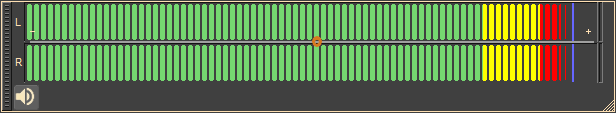
Meter (optional) - free floating and larger
Another change, often requested, is that the time position display be larger, so it can more easily be read a distance from the screen. It is larger now.
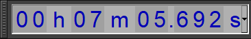
Time Display - now larger
These changes for 2.3.2x aren't as big as the original change of a new dark theme and new menu layout, but they continue the pattern of nudging Audacity to make Audacity become cleaner, clearer, and nicer to use.
The Differences 2.1.3x - Long Version
The obvious difference in DarkAudacity is the visual design. The colours and icons are different to Audacity and many of the shapes are simpler and more modern. DarkAudacity is still Audacity software. Underneath the same code is used. However there are also other customisations that make Dark Audacity a little different to standard Audacity.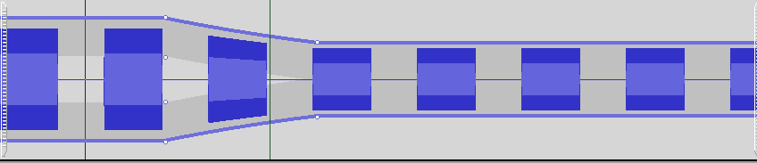
Before - original colour scheme
After - new colour scheme
I've changed the colours and the icons, but they are not the only thing I've changed.
Menus
Menus shorter and clearer than in Audacity
I’ve simplified the menus without losing functionality. I've made the menus shorter. I’ve kept the most used functions in the top levels of the menus. The functions moved down into lower sub menus are better organised.
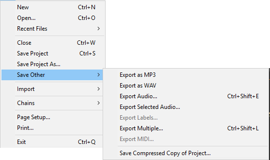
There are new menu items for exporting as MP3 or WAV. Previously you had to export audio, and then choose the format. You still can do that, but these new items are there for convenience.
One of the long standing bug-bears with Audacity is the distinction between ‘Save’ and ‘Export’. People expect to be able to open a wav audio file, edit it in Audacity and then click save. That isn't how Audacity works. Audacity needs audio in its own unique format to work on it. So Audacity converts when you 'open' a wav file and converts back when you 'save'. In an attempt to make this clearer Audacity uses the word 'import' for opening a file like wav and 'export' for converting and saving in a format like wav. Open and Save are reserved for its own format.
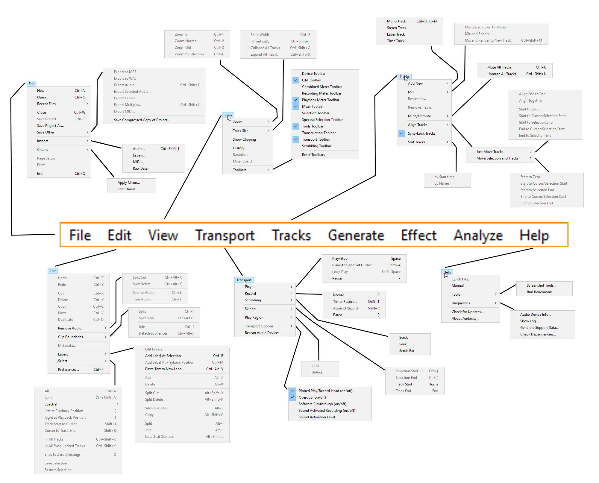
Click on the link for a complete Spider diagram of the menus.
Now the ‘Export’ options are under the ‘Save Other’
menu item, where people trying to
save audio as an MP3 or WAV file are more likely to find
them.
Where are the Numbers?
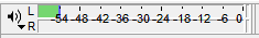
Before - numbers on the meter
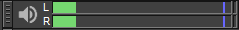
After - cleaner meter
In DarkAudacity I’ve taken away unnecessary numbers that
were just visual clutter. The meter doesn’t have numbers
now. You
still get a good sense of whether the recording volume is
set too high or too low. If you want numbers you can read
them off on the waveform view.
Other Clutter
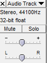
Before - redundant information on the panel
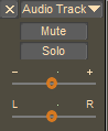
After - cleaner panel
The sliders for volume no longer have tick marks. They don’t need them because when you drag the slider a tooltip tells you the actual setting.
There used to be a display of sample rate, and format at the
left of the waveform. That was visual clutter too. Most
people don’t need it. If you do want it you can see those
settings
by clicking on the downward pointing triangle just to the
right of the track name.
Sync-Lock

Before - Sync-Lock button

After - Sync-Lock button not needed
The stop watch on the edit menu did not belong there. All the other buttons do something immediately like cut or paste audio when you click on them. Clicking on the stop watch turned something on or off. But what? Most people never found out.
The stop watch button was for 'Sync-Lock' a way to keep
tracks in step when you are editing a mix. When on,
tracks that edit in step gained a 'Sync-Lock' icon in the
panel to the left of the track. I intended to make that icon
into a button and use it to switch Sync-Lock on or off
instead, and
removed the main Sync-Lock button. However, I ran out of
time for making the icon into a button and in the end
decided a button wasn't needed.
I also decided to rename the feature from Sync-Lock to
Time-Lock. Time-Lock can be turned on or off from the Tracks
menu. Now that the menus have been reorganised, that's
a perfectly good way of using it. Time-Lock isn't turned on
or off
often enough to merit its own button.
Stuck in Pause

Before - paused (most things disabled)

After - paused (but not frozen)
Countless users have got stuck in Audacity with nothing responding because 'Pause' was down. The fix is very simple. Pause now pops up and recording or playback stops if you try to do something that you can't do when it is down. Why we didn't see we could fix this sooner in Audacity I don't know.
I've made a similar fix for 'Snap To'. 'Snap To' is a mode
in
which, for example, you find you'll always select a whole
number
of seconds, never parts of a second. The 'Snap To' mode
could
leave users stuck only able to select whole seconds when
they
want to go in and edit audio shorter than that. They
wouldn't
know why. The fix for that is simple too. When you zoom in
enough and select, any 'Snap To' is switched off again. I'd
like
to see that in mainstream Audacity in due course
too.
The Snap-To change didn't make it into the 2.1.3x version,
but is in the 2.3.2x version.
Record-Below

Before - Shift-Record records beside

After - Shift-Record now records below
Audacity used to start each new recording in a new track. The
result? You got a mix of all the recordings. If you held
shift
down when clicking record you got 'Record-Append' which I am
rechristening ‘Record-Beside’ and the
audio
was added on the end of the current audio track. Most people
want audio to add onto the end most of the time, so I
swapped
things round. Clicking record without shift now records
beside. Clicking
shift
and record now records below.
Pinned / Unpinned
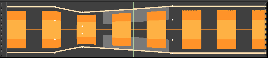
Audacity and DarkAudacity have a new feature, thanks to Paul Licameli. Play (and Record) can be pinned or unpinned. In pinned mode the play head stays fixed and the waveform moves relative to it. In unpinned the play head moves.

Unpinned Play Head Design

Pinned Play Head Design
DarkAudacity proposed the (obvious in hindsight) option of
using a pin to indicate pin and unpinned. Also DarkAudacity
first implemented the changing of the play head shape when
pinned
or unpinned as a way to signal to the user that a change had
been made to how play-audio behaves. Both changes have been
taken up
by Audacity. Steve in Audacity went on to make the pin icon
a bit
more pointy, which helps it look like a pin. They said it
looked too much like a cotton reel.
Next: Traffic Light Survey